Since the wonderful Blogger (or, as my friend
Matt MacNish called it, "Frogger,") went into meltdown Thursday and Friday, consequently revealing the extent of my blogging addiction, I decided to get revenge by totally making over my blog.
I feel like a proud Papa.
What do you think of the makeover? Are there still things I could do to make it even more beautiful? If so, please give me the benefit of your wisdom.
 |
| Give me Beauty, all the time |

Mike! I prefer this format because it's easier to find and read the text of your posts, which is what I come here to do! I am the least visually-oriented person you'll ever meet, so I have no other advice (as long as you make it easy for me to READ THE WORDS, I'm happy). Great work!
ReplyDeleteWell, this is lovely:-)Very clean and clear and beautiful!
ReplyDeleteLike many others I couldn't access Blogger at all and was completely bereft all day. It's rather worrying when realisation dawns that blogging has become a true addiction.
I also like the new look. It's more user friendly. Well done.
ReplyDeleteLovely! I can't help you; I have no skills in such things.
ReplyDeleteGive me beauty all the time...YES!
ReplyDeleteI like your new look, but I didn't have any trouble with the old look
but hey change is good...rearranging the furniture keeps the mind sharp
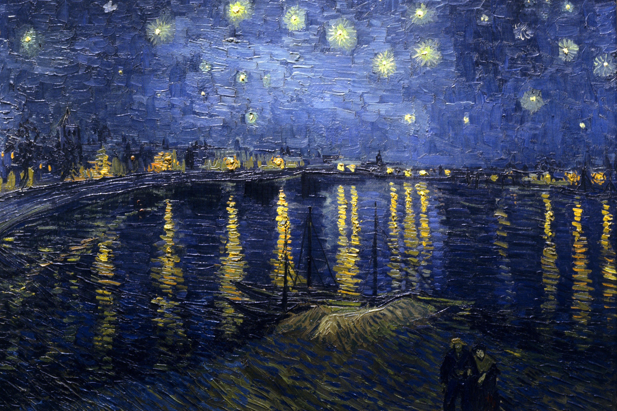
Should anything be read into the fact you have chosen a painting by an absinthe drinking, gonorrheaic, epileptic man that shows man's dominance over nature; (the gas lights are more prominent than the stars and the only two figures are in the foreground).
ReplyDeleteI liked your older blog layout, it was more 'bookish'.
Very nice, Mike. I like it!
ReplyDeleteLooks nice, but I don't remember having issues with the old one. But I like changing things out myself.
ReplyDeleteI can't decide if I like the new layout, or the fact that you called me a friend, more.
ReplyDeleteI'm honored!
I like it. I've found a good top bar helps too...not saying yours is bad...I also like the bold red. You and Matt are both awesome.
ReplyDelete